The Color Science Behind Therapist Websites
Over the past few months, color has become something of an obsession here at Koppla. It started as a practical question: why do some therapist websites feel immediately safe and trustworthy, while others — even beautifully designed ones — feel slightly off?
We kept pulling on that thread, and the more we researched, the more we realized that “feeling” is not subjective at all. We kind of knew it, but also not.
As a technology-first agency, we are wired to document what we find. So this post is our attempt to write up everything we have learned about color science, perception research, and what it actually means to build a palette that works for mental health professionals.
OK, WHAT? OH, OKLCH!
Every color in our therapist website builds (e.g. Aurora) is engineered using a modern color science standard called OKLCH, a perceptual color space that ensures your palette feels right, stays accessible, and works beautifully across every device. This post explains our design philosophy, the psychology behind the palettes we choose, and the technical foundation that makes it all work.
What Color Actually Does to Your Visitors
Color directly influences emotion and behavior in ways your visitors are not consciously aware of. Research on the physical design of therapeutic and professional environments consistently recommends cool tones to reduce perceived stress and promote safety.1 These principles translate directly to digital spaces: your website is an extension of your practice environment, and your visitors respond to screen colors the same way they respond to the walls of a waiting room.
Here is what the research tells us about color associations that matter most for mental health websites:
- Blues and blue-greens: Calm, trust, stability. The most consistently recommended tones for counseling websites.
- Greens: Renewal, balance, growth. Effective for holistic approaches, trauma recovery, or nature-based modalities.
- Warm neutrals (creams, taupes, soft beiges): Grounding, safety, non-clinical warmth.
- Purples: Wisdom, spirituality, creativity. Well-suited to mindfulness practices or expressive arts approaches.
- Warm accents (soft oranges, terracotta, amber): Energy, optimism, forward movement. Used sparingly, these are excellent for calls-to-action.
A randomized controlled trial on office environments found that low-saturation blue-green walls significantly reduced perceived stress among occupants compared to conventional gray-white tones, demonstrating that color choices in physical spaces have measurable effects on emotional state.2 A separate study on counseling room color found that among 75 psychological patients, blue-green environments were consistently rated as most pleasant, safe, and relaxing across multiple affective dimensions.3
But knowing which colors to use is only half the challenge. The other half is implementing them in a way that stays consistent, accessible, and predictable across every screen your clients use. And that is where most websites fall apart.
The Problem with How Most Websites Handle Color
If you have ever worked with a web designer, you have probably seen color values like #4A90D9 or hsl(210, 60%, 64%). These formats work, but they have a fundamental flaw that matters when you are building something as sensitive as a therapy website.
The core issue is with HSL (Hue, Saturation, Lightness). HSL claims to represent "lightness" as a simple percentage, but it lies. In HSL, yellow at 50% lightness looks dramatically brighter to the human eye than blue at 50% lightness.4 The numbers match, but the perceived experience does not. This creates real problems:
- Accessibility failures: Colors with identical lightness values can pass contrast checks in one hue and fail in another.
- Jarring interactions: Hover states and darker variants can become inaccessible or visually unpleasant, because "darker" in HSL is not perceptually uniform across hues.
- Inconsistent palettes: A brand color that looks calm alone can produce muddy gradients when combined with other colors.
- Device inconsistency: Colors that look vibrant on a designer's high-end display may appear washed out on the laptop or phone your client is using.
The workaround, manually testing every color variation, is tedious, error-prone, and does not scale across many therapy practices.
Think of it this way: HSL is like a map that claims all roads are the same length. It works as a rough guide, but if you try to use it for precise navigation, you end up somewhere unexpected.
Here is a concrete example: in HSL, if you create a "lighter" version of a teal button by increasing lightness from 40% to 55%, the resulting color can appear more washed-out and pale than a genuinely lighter teal, losing its saturation in unpredictable ways, because HSL's lightness curve is not uniform across hues. In OKLCH, increasing L from 0.50 to 0.65 on the same teal produces a color that genuinely looks lighter to your eye, because the scale is calibrated to human perception.
What we need is a color format where the numbers actually mean what they say.
Enter OKLCH: Color as Your Eyes Actually See It
OKLCH is a modern CSS color format created in 2020 by Björn Ottosson, a Swedish engineer who designed it as a perceptual color space, meaning its numerical values actually correspond to how human eyes experience color.5
Three components define every color:
- L (Lightness): Perceived lightness on a scale from 0 (black) to 1 (white). Unlike HSL, this value is actually perceptually uniform. If two colors share the same L value, they genuinely look the same brightness to the human eye, regardless of their hue.
- C (Chroma): How saturated or vivid a color is, ranging from 0 (completely gray) to roughly 0.32–0.40 depending on the hue and the display's color gamut.
- H (Hue): The hue angle from 0 to 360, cycling through reds, yellows, greens, blues, and purples.
In just a few years, OKLCH has gone from a personal research project to an industry standard. It is now used as the gradient interpolation method in Photoshop, part of the CSS Color Level 4 and Level 5 specifications, and supported by all major browsers including Chrome, Safari, and Firefox.54
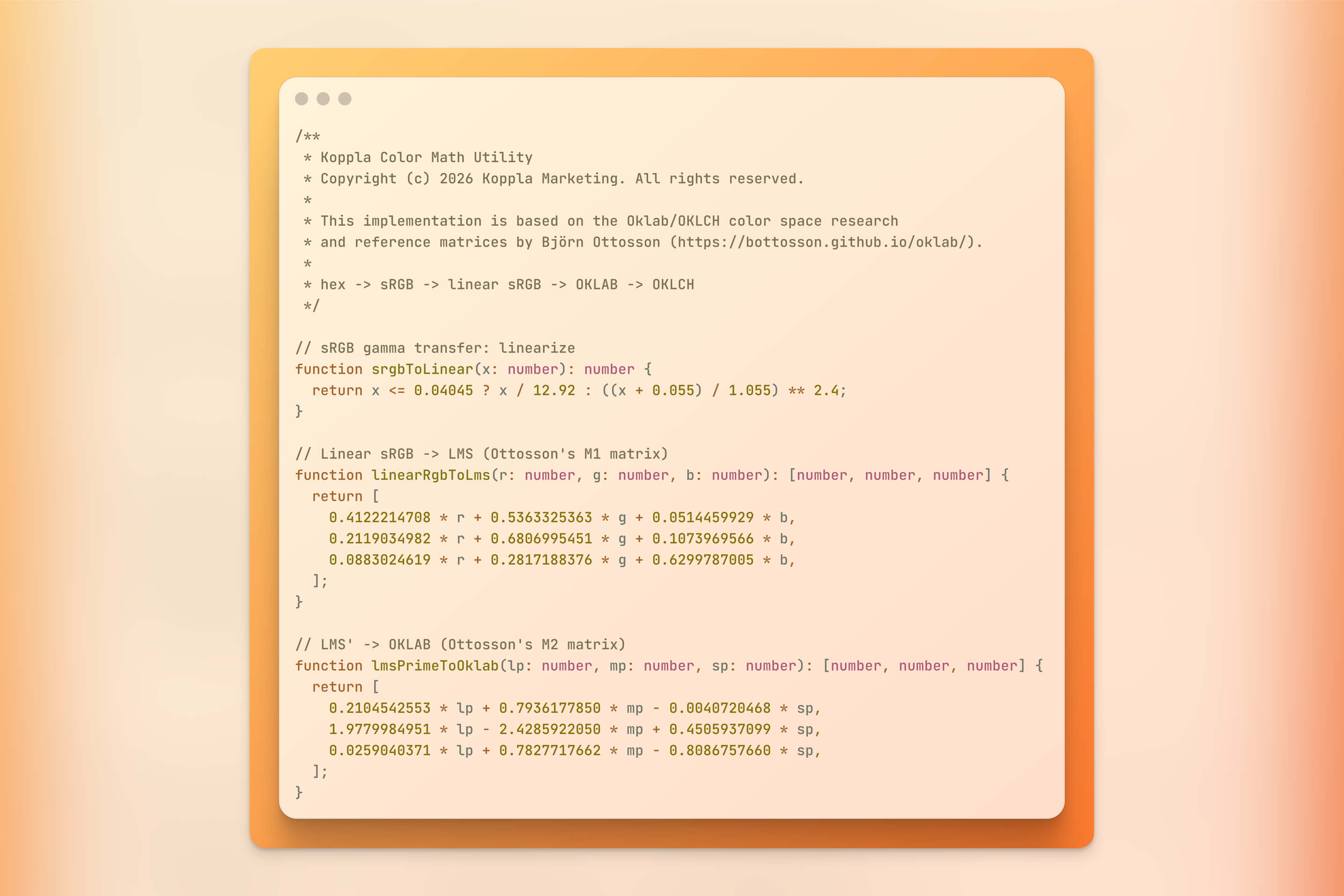
Here is what makes OKLCH different in practical terms:
/* HSL: what do these numbers mean? Hard to tell. */
color: hsl(210, 60%, 64%);

/* ...the HEX version is equally confusing */
color: #6da3da;

/* OKLCH: human-readable and perceptually accurate */
color: oklch(0.7 0.1 250);
/* medium bright (0.7) | moderately saturated (0.1) | blue (250) */
And here is the visual representation of that OKLCH color:
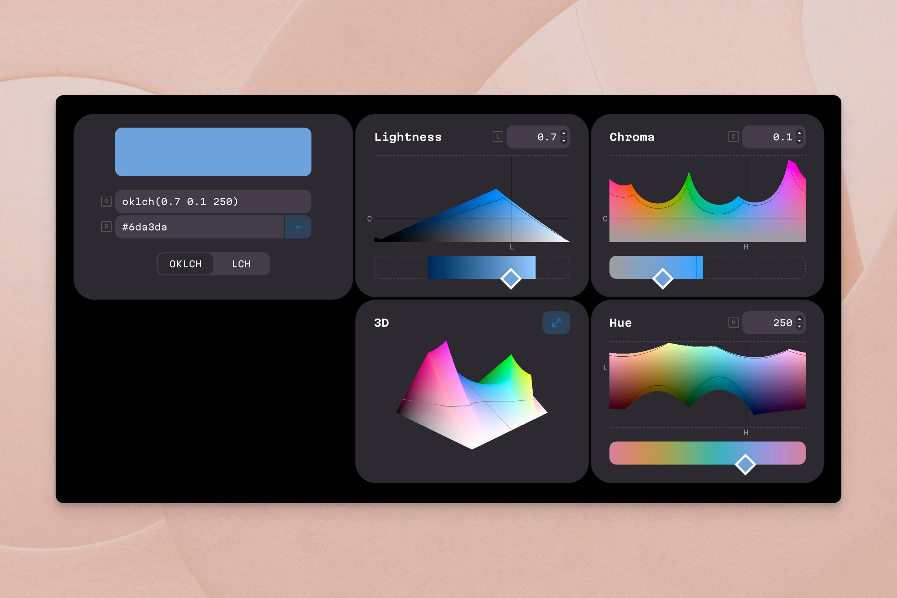
With OKLCH, you can look at the numbers and understand the color. More importantly, you can change one value and predict what will happen.
Increase L for lighter.
Decrease C for more muted.
Change H for a different hue at approximately the same visual weight (something no other widely-used color format can reliably offer). The result looks as expected because the color space is not deformed.
OKLCH also corrects a known limitation of its predecessor LCH: in LCH, adjusting chroma on blue tones would cause unexpected hue shifts toward purple. OKLCH remaps the hue axis to eliminate this instability, making it reliable across the entire color wheel.4
How Koppla Uses OKLCH When Building Your Website
Our approach to color is one part of a broader design philosophy, grounded in technical rigor, that drives everything we build for mental health professionals. Here is how it works in practice.
Step 1: Starting from psychology, not preferences
Before we choose a single color, we consider your clinical specialty, your ideal client's likely emotional state, and the feeling you want your practice's digital front door to communicate.
A trauma therapist and an ADHD coach serve very different clients with very different needs, even if both like "green." Our color choices reflect these differences at the foundation level.
Step 2: Anchoring your palette in OKLCH
We define your primary brand color as an OKLCH value. Every other color in your design system is derived mathematically from that anchor by adjusting one component (L, C, or H) while holding the others constant. We are not eyeballing a "darker version" of your brand color. We are precisely controlling perceived lightness.
/* Your primary brand color */
--primary: oklch(0.65 0.13 220);

/* Lighter background: same hue, reduced chroma, higher lightness */
--bg-light: oklch(0.92 0.03 220);

/* Darker hover state: same hue and chroma, lower lightness */
--primary-hover: oklch(0.5 0.13 220);

/* Warm accent for CTAs: similar lightness, different hue */
--accent: oklch(0.72 0.1 55);
In plain terms: we have told your website that your brand color is a medium-brightness, moderately saturated blue (hue 220). Every other color in your site is defined relative to that anchor. Lighter for backgrounds, darker for hover states, warmer for buttons. The math keeps everything in harmony automatically.
Step 3: Accessibility baked in from the start
Because OKLCH's lightness value maps directly to actual perceived brightness, we can calculate whether any text-and-background combination meets WCAG 2.1 AA contrast requirements (a minimum 4.5:1 ratio) before we ever open a browser.6
This matters more than you might think. Nearly 8% of men and 0.5% of women experience some form of color vision deficiency.7 A therapist's website must be readable for every potential client, not just those with typical color perception. By building accessibility into the color model itself rather than bolting it on as an afterthought, we can catch contrast issues at the palette generation stage, not during a post-launch accessibility audit. (Yes, we do that too, but we prefer to get it right the first time.)
Step 4: Wide-gamut P3 colors where it matters
Modern Apple devices and many OLED screens support a color gamut called P3, which can display roughly 30% more colors than the older sRGB standard.4 Because OKLCH can encode colors beyond sRGB, we serve richer versions of your palette on P3-capable devices while gracefully falling back to standard sRGB colors on older screens.
Step 5: Dark mode and theme variants without a redesign
The Aurora website template supports both light and dark modes, automatically adapting to your visitors' system preferences. With OKLCH, creating a complete dark-mode palette does not require redesigning the color system. We simply reassign lightness values while keeping hue and chroma relationships intact.
CSS custom properties make this seamless:
:root {
  --surface: oklch(0.97 0.005 220);
  --text: oklch(0.2 0 0);
}

@media (prefers-color-scheme: dark) {
  :root {
    --surface: oklch(0.15 0.01 220);
    --text: oklch(0.93 0 0);
  }
}
The hue stays consistent. The relationships between colors stay consistent. Only the lightness axis changes, so your website feels like the same practice whether someone visits at noon or at midnight with dark mode enabled.
A Practical Example: Building a Palette for an Anxiety Specialist
To make this tangible, let's walk through how we would build a color palette for a licensed therapist specializing in anxiety and stress management.
| Role | OKLCH Value | What It Communicates |
|---|---|---|
| Primary (Teal Blue) | oklch(0.65 0.12 220) | Calm, trust, stability |
| Light background | oklch(0.92 0.03 220) | Airy, open, safe space |
| Darker hover state | oklch(0.50 0.12 220) | Depth, reliability |
| Warm accent (CTA) | oklch(0.72 0.10 55) | Warmth, approachability |
| Neutral text | oklch(0.20 0.00 0) | High contrast, readable |
Notice the deliberate relationships. Hue 220 is consistent across all the blue tones. Lightness changes are predictable on OKLCH's perceptual scale. The warm accent at hue 55 draws the eye to action buttons without clashing, because its lightness is carefully calibrated against the other values.
This palette derivation powers every custom website we build, including the Aurora website.
We have also built a custom color picker tool that allows you to generate and visualize OKLCH palettes in real time:
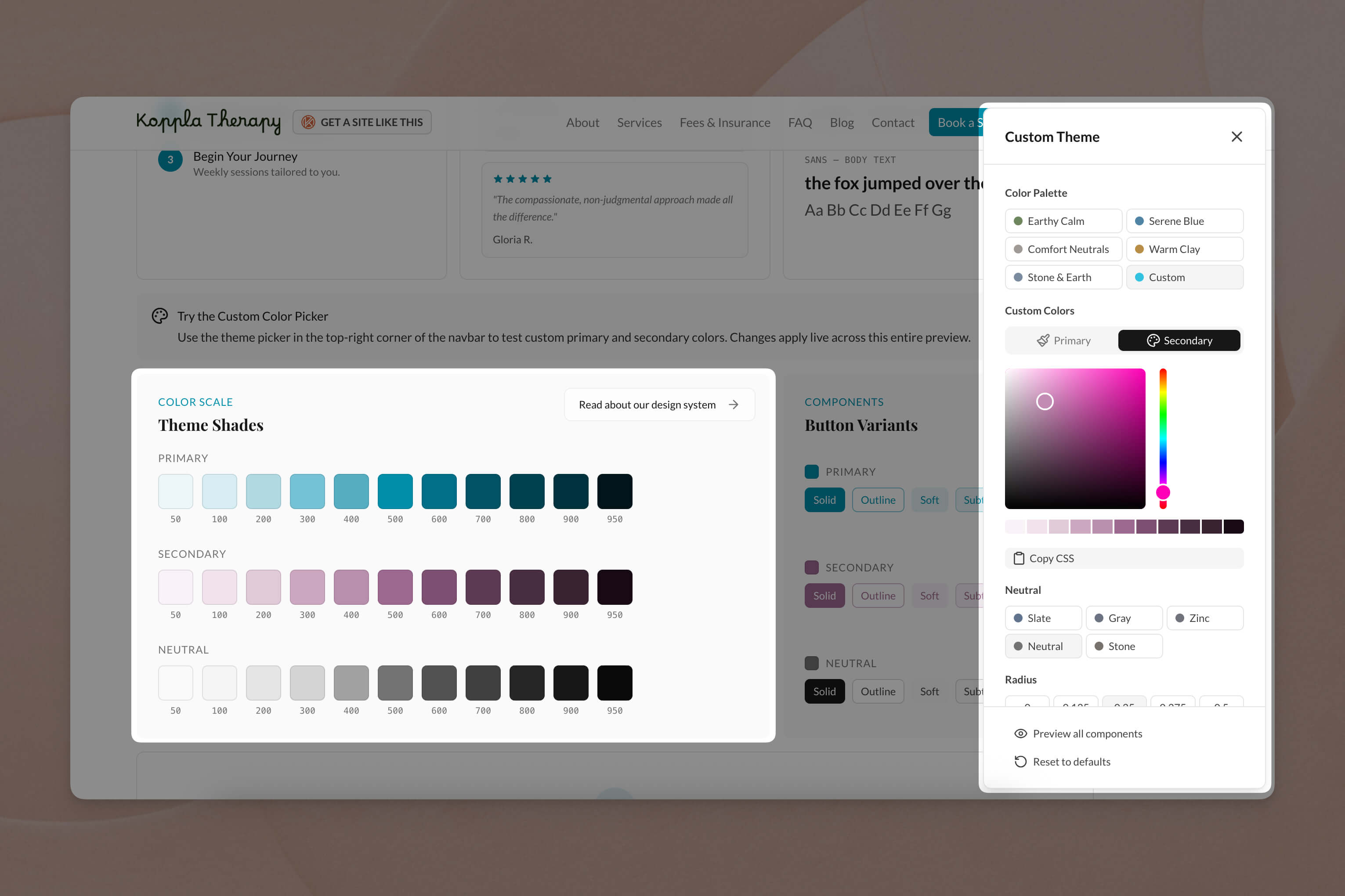
Why This Matters More for Mental Health Websites
A person searching for a therapist is often in a vulnerable emotional state. Their decision to reach out may take days or weeks, and your website's visual tone is part of what earns their trust long before they pick up the phone.
Getting color "wrong" in this context does not just hurt conversion rates. It can signal that a practice does not feel safe, regulated, or aligned with the client's needs. Color inconsistencies, such as jarring hover effects, inaccessible text, or muddy gradients, subconsciously communicate carelessness. That is the opposite of what a therapist wants to project.
Accessibility as an ethical responsibility
Color accessibility carries an ethical dimension. Your services should be visually reachable to everyone, including people with visual impairments or color vision deficiencies who are navigating the already difficult process of finding the right therapist.7 Our approach ensures these considerations are not added during a final audit. They are engineered into the palette from day one.
Meeting clients where they are
People search for therapists at all hours, often during evenings and late-night hours when they are using dark mode or browsing in low-light conditions. A website that handles these scenarios gracefully, with consistent colors, readable text, and appropriate contrast, meets clients wherever they actually are.
The Bigger Picture: Intentionality Over Convention
Color is the first signal your website sends, but every design decision at Koppla follows the same principle: intentionality over convention. We do not use a tool or technique because it is popular. We use it because it produces measurably better results for your clients and your practice.
That principle drives our specialty-focused service pages, our content marketing approach, and even how we optimize page speed. The goal is always the same: make it easier for people who need mental health support to find the right therapist.
Your Color Palette is a Clinical Tool
Your visitors are not consciously evaluating your hex codes. But they are absorbing the emotional signal your website sends in those first critical moments. A palette built on perceptual color science sends a signal of care, consistency, and professionalism before a single word is read.
OKLCH gives us the tools to make that signal intentional rather than accidental. It is the most precise, accessible, and future-proof way to implement color on a modern website, and it is the standard we use for every therapist website we build.
If you are ready for a website that earns trust from the very first glance, explore our therapist website service or get in touch to discuss what the right palette looks like for your practice. Your clients deserve a first impression that was made with intention.
Sources
Footnotes
- Interior Space Design for Psychotherapy Sessions. Arts & Humanities Open Access Journal. https://artshumanities.partium.ro/index.php/pah/article/download/150/63 ↩
- The role of color psychology in alleviating workplace stress through office space design: a randomized controlled trial. Presented at the SIRS 2026 Annual Meeting. Schizophrenia Bulletin Schizophrenia Bulletin, 52(Supplement_1), S64. https://academic.oup.com/schizophreniabulletin/article/52/Supplement_1/S64/8482418 ↩
- Optimal Color Design of Psychological Counseling Room by Design of Experiments and Response Surface Methodology. PLOS ONE. https://pmc.ncbi.nlm.nih.gov/articles/PMC3942464/ ↩
- Sitnik, A. & Turner, T. OKLCH in CSS: why we moved from RGB and HSL. Evil Martians. https://evilmartians.com/chronicles/oklch-in-css-why-quit-rgb-hsl ↩ ↩2 ↩3 ↩4
- Ottosson, B. (2020). A perceptual color space for image processing. https://bottosson.github.io/posts/oklab/ ↩ ↩2
- Web Content Accessibility Guidelines (WCAG) 2.1, Success Criterion 1.4.3: Contrast (Minimum). W3C. https://www.w3.org/TR/WCAG21/#contrast-minimum ↩
- ADA Compliant Therapist Website: Complete Accessibility Guide. Mental Health IT Solutions. https://mentalhealthitsolutions.com/blog/ada-compliant-therapist-website/ ↩ ↩2